Check out what's new:
Best practices in UI design for onboarding
Learn best practices in UI design for onboarding. Great UI design helps make game onboarding smoother and improves player retention.

This is the second part of our four part series on game UX and game onboarding experiences. See the first post on best practices in video game onboarding.
A successful video game onboarding process relies heavily on great video game UI. While a number of roles are critical to the game onboarding process like the game designer and the narrative designer – the game UI designer might just be the MVP.
Designing an effective user interface (UI) for video game onboarding is, after all, a significant design challenge. It's not just about creating an aesthetically pleasing game UI design layout but also about making sure it’s intuitive so that it guides players without overwhelming them. Balancing the need to convey information with the need for an unobtrusive interface that doesn't disrupt the gameplay experience is hard.
When onboarding game design fails to strike this balance, it risks becoming a barrier that frustrates players or makes learning the game harder. Poorly designed game onboarding UX (user experience) can frustrate players, causing them to view the initial stages of a game as an impediment rather than an engaging introduction.
In this piece, we'll delve into common best practices for video game UI design by exploring the nuances of game onboarding UX. We'll explore strategies to craft game UI designs customized to the needs of game onboarding that not only inform but also captivate in order to ensure a smoother game onboarding experience for all players.
Video game UI design elements: Types of game onboarding
The type of video game onboarding UX you chose to include in your game greatly influences the strategies you’ll want to employ in game tutorial UI. Each onboarding game design approach outlined below demands specific game UI design considerations to enhance user understanding and engagement.
Walkthroughs
Walkthroughs are guided tours through game mechanics that offer detailed explanations and step-by-step instructions can be more helpful than more structured game tutorials. The right game UI elements can help players during the initial learning phase without interrupting the gameplay flow.
Examples of video game UI design elements you would want to use in walkthroughs include:
- Game tutorial pop-ups
- Interactive but unobtrusive tooltips
- Narrative-driven guidance
- Intuitive icons or symbols in the UI
Hands-on gameplay
Game onboarding UX focused on hands-on gameplay emphasizes learning through direct interaction and experimentation, encouraging players to discover mechanics by doing rather than through explicit guidance. The right UI elements enhance the new player experience by subtly guiding players without hindering their freedom to explore like some game tutorials do.
Examples of video game UI design elements you would want to use in hands-on gameplay include:
- Responsive controls
- Unambiguous feedback
- Tooltips
- Unobtrusive prompts during critical moments
Hybrid approach
A hybrid onboarding game design mixes elements of both walkthroughs and hands-on gameplay, in a way that provides guided assistance while allowing for player autonomy in hands-on gameplay. The right UI elements ensure a comprehensive new player experience that caters to various player preferences and learning styles.
Examples of video game UI design elements you would want to use in a hybrid game onboarding approach include:
- Adaptive game tutorials
- Interactive guidance available on demand
- Contextual hints that maintain immersion while supporting players
How video game UI design helps with game onboarding UX
The UI design principles listed in this section significantly help with video game onboarding UX by allowing for intuitive interactions and by simplifying the learning curve for new players.
Intuitive and simple game UI design

Simple and intuitive game UI design doesn’t just streamline navigation, it also reduces cognitive load while players are learning how to play the game. This allows players to better focus on learning game mechanics.
- Create an intuitive and simple game UI design for onboarding to prioritize clarity and ease of navigation.
- Use recognizable icons, minimal text, and straightforward visual cues to guide players through the initial learning process.
- Implement consistent design elements across screens as part of your onboarding game design.
Example:The minimalist and user-friendly interface in Journey guides players seamlessly without overwhelming them by using intuitive symbols and clear directional cues.
Game UI Color

Color plays a pivotal role in game UI design for onboarding, as it aids in conveying information, highlighting important elements, and evoking emotions. Vibrant colors can draw attention to crucial buttons or prompts, while subdued tones might indicate passive elements.
- Employ a cohesive and purposeful color palette to convey information and guide player attention.
- Highlight essential elements or interactive buttons with contrasting colors to draw attention to key features.
- Aim for consistency in color usage throughout the whole video game UI design, along with color associations for specific actions or states. This helps in creating a visual language that ensures players will better understand the game's mechanics.
Example: Subnautica uses color schemes in their game UI effectively by using contrasting colors to signify danger or alertness, guiding players' attention to critical details during the game onboarding process.
Animations or effects
Animations and effects in video game UI design contribute to game onboarding UX by providing visual feedback, guiding player actions, and creating an engaging experience. Thoughtful use of animations, such as subtle transitions or interactive elements, can direct focus and communicate functionality.
- Use animations for transitions or for highlighting interactive elements to direct player attention and emphasize important actions.
- Implement effects thoughtfully, such as hover animations or feedback animations upon successful interactions. These help by providing immediate and clear responses.
Example: Games like Ori and the Blind Forest use visually stunning animations to guide players through tutorials, ensuring a captivating and informative game onboarding UX.
Game UI messages

Game messages or alerts in video game UI design serve as informative cues, guiding players' actions and providing crucial information during onboarding. Incorporating game messages in your onboarding game design involves timely and contextually relevant pop-ups or alerts to convey essential information without disrupting gameplay.
- Use concise and informative messages to assist players in learning new mechanics and provide tips during critical moments.
- Deploy interactive tutorials or tooltips that can be accessed at the player's discretion to help in delivering additional information when needed, ensuring a seamless learning experience without overwhelming the player.
- Maintain clarity and relevance in these messages to help enhance the player’s understanding of game mechanics without hindering immersion.
- Deliver more complex messages in an amusing and unobtrusive way from AI NPCs so players can ask questions if they need to.
Example: Well-timed alerts in games like Stardew Valley assist players by offering contextual information about in-game events or mechanics, improving their understanding without disrupting gameplay.
Game UI Sounds
Sounds integrated into UI design enhance the onboarding UX by providing auditory cues, feedback, or alerts, aiding in conveying information and reinforcing interactions. Incorporating game UI sounds in onboarding game design involves using auditory cues to complement visual feedback and reinforce player interactions.
- Leverage subtle and purposeful sound effects for button clicks or menu selections to provide immediate feedback, confirming successful actions.
- Use distinct sounds for alerts or notifications to help in drawing attention to important information or prompts to enhance the overall usability of the game onboarding process.
- Ensure a balanced and non-intrusive approach to sound design to contribute to a more immersive and engaging user experience without overwhelming the player.
Example: Games like The Last of Us use subtle sound effects to recognize successful actions or prompts during game onboarding. This creates an immersive learning environment without too much visual disruption.
Progress bars

Progress bars in UI design serve as visual indicators of advancement, helping players track their progress and understand their position within the game. Implementing progress bars in the game UI in your onboarding game design involves visually representing players' advancement through various stages or tutorials. These bars provide a clear sign of completion, offering a sense of accomplishment and direction during the learning process, enhancing the new player experience.
- Use progress bars that dynamically update as players complete tasks or tutorials to help convey the onboarding experience’s length and also to help in managing player expectations.
- Incorporate segmented progress bars or milestones to help break down complex onboarding processes into manageable steps.
Example: Games like Genshin Impact use progress bars effectively to indicate character progression or loading times, providing players with clear visual cues during onboarding.
Menus

Menus in video game UI design play a vital role in onboarding by organizing information and options, facilitating easy navigation and access to game features. Incorporating menus in game tutorial design involves organizing and presenting essential information and options in a clear and accessible manner.
- Use an intuitive menu structure with concise labels and categorizations to help guide players through various onboarding sections or tutorials.
- Use contextual menus to also offer relevant options based on the player's current stage or task to streamline the learning process and avoid overwhelming the player with unnecessary information.
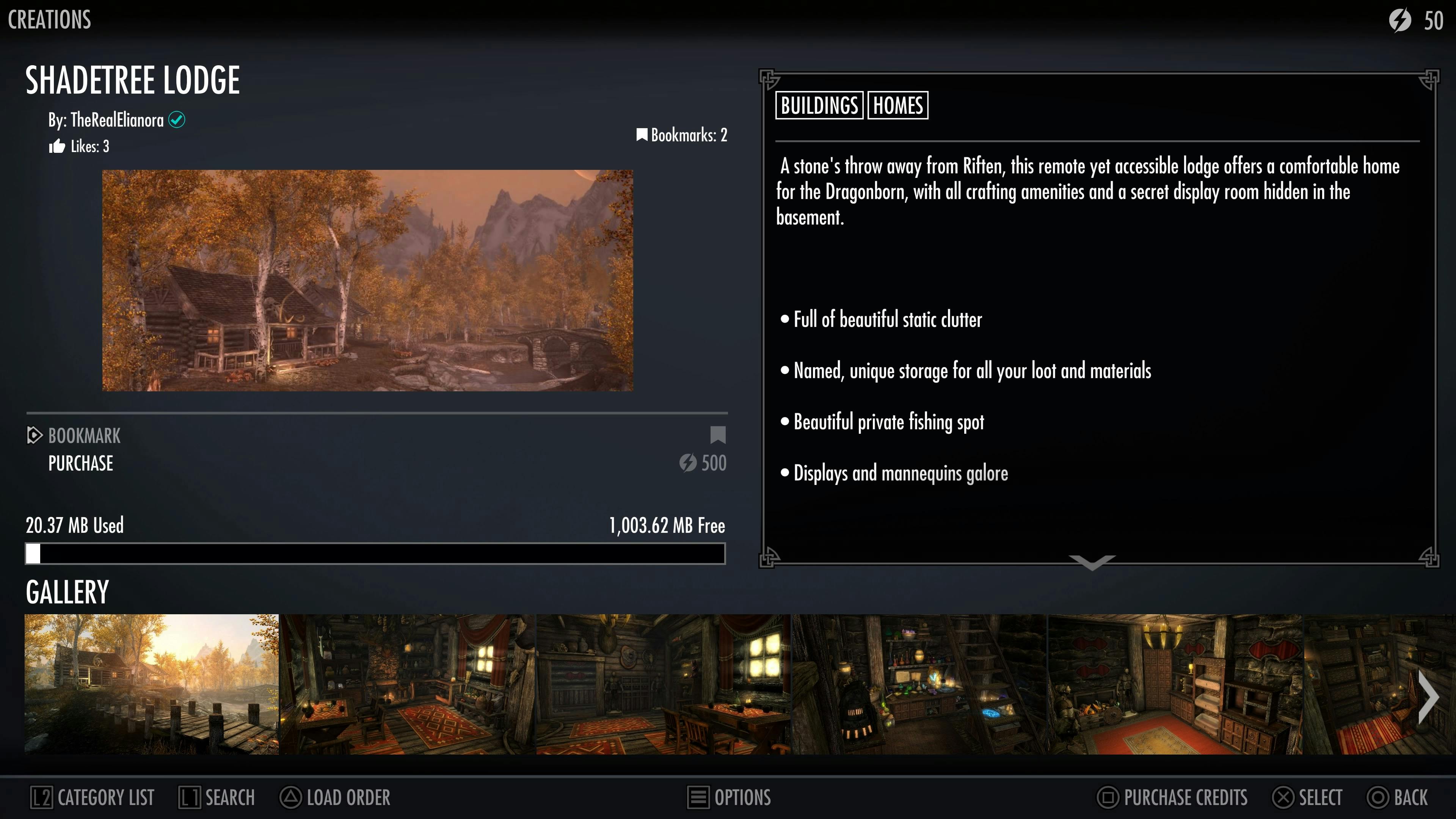
Example: Well-structured game UI menus, like those in Skyrim, offer clear categorization and easy access to various functionalities. This streamlines the game onboarding process.
Accessibility
Accessibility features in video game UI design significantly impact game onboarding UX by ensuring inclusivity and accommodating diverse player needs. Incorporating options like customizable controls or text size enhance accessibility, allowing players with varying abilities or preferences to navigate the onboarding process comfortably.
- Implement adjustable font sizes, clear and readable text, and color contrast options in the game UI to accommodate players with visual impairments.
- Provide customizable control schemes or input options for players with diverse motor abilities, allowing them to navigate the game onboarding process more comfortably.
- Use audio cues, subtitles, or alternative text for visual elements to enhance the accessibility of the onboarding experience for players with hearing impairments or cognitive differences.
- Use AI NPCs for game onboarding to allow players to verbally ask questions about the game world and game functionalities anytime they need.
- Example: Assassin's Creed Valhalla includes comprehensive accessibility settings in the UI, like menu narration, colorblind modes, and various UI adjustments, ensuring a more inclusive gaming experience for diverse players.
Improve your game onboarding design with AI NPCs
While game UI is a critical part of game onboarding, there are some questions players will have that you won’t be able to answer with smart game UI design alone. Adding AI NPCs to your onboarding flow gives your players someone to ask their pressing questions to ensure the game onboarding UX is customized to each player’s needs and skill level.
Research we conducted with 1,000 gamers also showed that they’re excited to interact with AI NPCs.
- 99% felt AI NPCs would enhance gameplay
- 78% felt like they would spend more time playing
- 79% would be more likely to buy a game
Curious about AI NPCs? Check out our Case Studies to see how they’ve been used in games.